Build a Custom Multi-Column Checkbox Dropdown in Filament

Learn how to build a user-friendly multi-column custom checkbox dropdown using Laravel Filament to provide improved and better selection options for your users.

Filament is a powerful admin panel for Laravel, but sometimes your UI needs go beyond its built-in fields. In this tutorial, we’ll walk through how to build a custom checkbox dropdown component in Filament that supports multiple columns and compatible with dark mode.
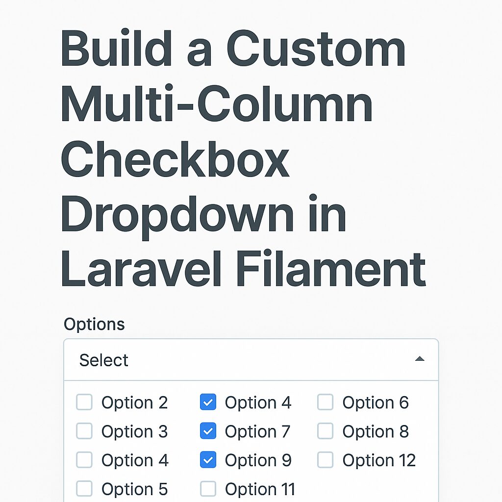
Goal

We want to display a dropdown that, when opened, shows a list of checkboxes (e.g. for selecting items). The checkboxes should:

  • Be selectable via checkboxes
  • Be arranged in multiple columns
  • Store selections in a Livewire model
  • Work with dark mode

The purpose for this component is, I have a list of more than 100 entries. If I take CheckboxList component, all of these entries take so much space in UI. Similarly, If I add multiselect Select component, It will not show all entries at once and user have to type name to search for entries.

So, dropdown will reduce the space in UI and checkboxes solve searching problem.

Step 1: Create the Custom Field Component

Create the filament custom checkbox dropdown field component file at app/Forms/Components/CheckboxDropdown.php and add the following code.

<?php
namespace App\Forms\Components;

use Filament\Forms\Components\Field;

class CheckboxDropdown extends Field
{
    protected string $view = 'forms.components.checkbox-dropdown';

    protected array $options = [];

    protected int $checkboxColumns = 1;

    public function options(array $options): static
    {
        $this->options = $options;
        return $this;
    }

    public function getOptions(): array
    {
        return $this->evaluate($this->options);
    }

    public function checkboxColumns(int $count): static
    {
        $this->checkboxColumns = $count;
        return $this;
    }

    public function getCheckboxColumns(): int
    {
        return $this->evaluate($this->checkboxColumns);
    }
}

Step 2: Create a blade view file for the component

As mentioned in the component class, create a custom checkbox dropdown component view file at resources/views/forms/components/checkbox-dropdown.blade.php and add the following code.

@php
$options = collect($getOptions())->mapWithKeys(fn ($label, $id) => [(string) $id => $label]);
$jsonOptions = $options->toJson();
$gridCols = match ($getCheckboxColumns()) {
    1 => 'grid-cols-1',
    2 => 'grid-cols-2',
    3 => 'grid-cols-3',
    4 => 'grid-cols-4',
    default => 'grid-cols-1',
};
@endphp

<div
    x-data="{
        open: false,
        toggle() { this.open = !this.open },
        selected: @js($getState() ?? []),
        liveSelected: @entangle($attributes->wire('model')).defer,
        options: {{ $jsonOptions }} || {},
        isSelected(id) {
            return this.selected?.includes(id);
        },
        labelFor(id) {
            if (!this.options || typeof this.options !== 'object') return id;
            return this.options[id] ?? id;
        }
    }"
    class="relative">
    <!-- Trigger Button -->
    <button
        type="button"
        @click="toggle"
        class="w-full border rounded px-3 py-2 text-left bg-white dark:bg-gray-900 border-gray-300 dark:border-gray-700 text-gray-800 dark:text-gray-200 shadow-sm">
        <template x-if="selected?.length">
            <span x-text="selected.map(labelFor).join(', ')"></span>
        </template>
        <template x-if="!selected?.length">
            <span class="text-gray-400 dark:text-gray-500">Select items...</span>
        </template>
    </button>

    <!-- Dropdown Panel -->
    <div
        x-show="open"
        @click.away="open = false"
        x-cloak
        class="absolute z-10 w-full mt-1 rounded border bg-white dark:bg-gray-900 border-gray-300 dark:border-gray-700 shadow max-h-60 overflow-y-auto">
        <ul class="p-2 grid {{ $gridCols }} space-y-1 gap-2">
            <template x-for="(label, id) in options" :key="id">
                <li>
                    <label class="flex gap-2 items-start space-x-2 text-gray-800 dark:text-gray-200">
                        <input
                            type="checkbox"
                            class="fi-checkbox-input rounded border-none bg-white shadow-sm ring-1 transition duration-75 checked:ring-0 focus:ring-2 focus:ring-offset-0 disabled:pointer-events-none disabled:bg-gray-50 disabled:text-gray-50 disabled:checked:bg-gray-400 disabled:checked:text-gray-400 dark:bg-white/5 dark:disabled:bg-transparent dark:disabled:checked:bg-gray-600 text-primary-600 ring-gray-950/10 focus:ring-primary-600 checked:focus:ring-primary-500/50 dark:text-primary-500 dark:ring-white/20 dark:checked:bg-primary-500 dark:focus:ring-primary-500 dark:checked:focus:ring-primary-400/50 dark:disabled:ring-white/10 mt-1"
                            :value="id"
                            :checked="isSelected(id)"
                            @change="
                                if (isSelected(id)) {
                                    selected = selected.filter(i => i !== id)
                                } else {
                                    selected.push(id)
                                }
                                liveSelected = selected;
                            ">
                        <span x-text="label"></span>
                    </label>
                </li>
            </template>
        </ul>
    </div>
</div>

Now this component id ready to use. Currently, it can adopt current filament admin panel theme and you can distribute checkboxes to multiple columns using checkboxColumns option.

Step 3: Usage in Filament Resource

You can use this custom checkbox dropdown component in any resource file as follows:

CheckboxDropdown::make('selected_items')
    ->label('Select Items')
    ->options(Item::pluck('name', 'id')->toArray())
    ->checkboxColumns(3)

Conclusion

With this setup, you can develop a fully reusable, dynamic, and user-friendly multi-column checkbox dropdown — perfect for any Laravel Filament project.

Develop Contact Form using Livewire in Laravel

Learn how to create a responsive contact form using Livewire in Laravel. Step-by-step tutorial with validation, form submission, and real-time updates.

Developing a Contact form using Livewire in Laravel is straightforward and involves a very few key steps.

In this post, we will learn to develop contact form using Livewire component in Laravel. Follow the below steps:

Step 1: Install Livewire

To create any Livewire form, you must have Livewire installed over Laravel project. If you haven’t installed Livewire yet, you can do so via Composer:

composer require livewire/livewire

It will install Livewire package to you Laravel project.

Step 2: Create a Livewire Component

Now, we need to create a Livewire component for contact form. You can generate a Livewire component using Artisan command as follows:

php artisan make:livewire ContactForm

This will create 2 files as follows:

  • A Livewire component file at app/Http/Livewire/ContactForm.php
  • A Blade view at resources/views/livewire/contact-form.blade.php

Your contact form component is now ready to be used. But, we haven’t added any logic or any design to this component. So, if you add this component to any file, it will display blank page.

Step 3: Define the Livewire Component Logic

Open app/Http/Livewire/ContactForm.php and add all contact form related logic to the file as follows:

namespace App\Http\Livewire;

use Livewire\Component;
use App\Models\Contact;
use Illuminate\Validation\Rule;

class ContactForm extends Component
{
    public $name, $email, $message;

    protected $rules = [
        'name' => 'required|min:3',
        'email' => 'required|email',
        'message' => 'required|min:5',
    ];

    public function submit()
    {
        $this->validate();

        // Save data
        Contact::create([
            'name' => $this->name,
            'email' => $this->email,
            'message' => $this->message,
        ]);

        // Reset the form
        $this->reset(['name', 'email', 'message']);

        session()->flash('success', 'Your message has been sent!');
    }

    public function render()
    {
        return view('livewire.contact-form');
    }
}

Step 4: Create the Livewire Blade View

Open resources/views/livewire/contact-form.blade.php and update the HTML form as per your requirement. I have added my blade file design as follows:

<div>
    @if (session()->has('success'))
        <div class="p-3 mb-4 text-green-600 bg-green-200 border border-green-600 rounded">
            {{ session('success') }}
        </div>
    @endif

    <form wire:submit.prevent="submit">
        <div class="mb-4">
            <label for="name" class="block font-bold">Name:</label>
            <input type="text" id="name" wire:model="name" class="w-full p-2 border rounded">
            @error('name') <span class="text-red-600">{{ $message }}</span> @enderror
        </div>

        <div class="mb-4">
            <label for="email" class="block font-bold">Email:</label>
            <input type="email" id="email" wire:model="email" class="w-full p-2 border rounded">
            @error('email') <span class="text-red-600">{{ $message }}</span> @enderror
        </div>

        <div class="mb-4">
            <label for="message" class="block font-bold">Message:</label>
            <textarea id="message" wire:model="message" class="w-full p-2 border rounded"></textarea>
            @error('message') <span class="text-red-600">{{ $message }}</span> @enderror
        </div>

        <button type="submit" class="px-4 py-2 text-white bg-blue-600 rounded">Send</button>
    </form>
</div>

I have added some additional features like displaying success message and added error message display elements to each fields.

Step 5: Add Livewire to a Page

Now it is ready to be included to any page. You can include this component using @livewire directive provided by Livewire package. Include this Livewire component in your Blade view (e.g., resources/views/contact.blade.php):

@extends('layouts.app')

@section('content')
    <div class="container mx-auto p-4">
        <h1 class="text-xl font-bold">Contact Us</h1>
        @livewire('contact-form')
    </div>
@endsection

Still it is not visible to the page. Because, Livewire scripts and styles are missing.

Step 6: Include Livewire Scripts

You have to add Livewire scripts and styles to the layout, where you want to display any Livewire Component. You can add Livewire scripts and styles to the layout using their directives @livewireScripts and @livewireStyles respectively.

Add Livewire scripts in your layouts/app.blade.php file before the closing </body> tag of the layout file:

@livewireScripts
</body>
</html>

And add the Livewire styles in <head> tag of the layout file:

@livewireStyles

Note: If you have multiple layouts and these layouts are used to display Livewire Compoment pages, then you have to add Livewire scripts and styles in all of these layouts.

Step 7: Run Migrations and Serve the App

In component file, we have added a code to save contact form details to the database. So, If you don’t have contacts table already, create a migration for the contacts table:

php artisan make:migration create_contacts_table

Open the migration file (database/migrations/xxxx_xx_xx_xxxxxx_create_contacts_table.php) and add the necessary fields as follows:

public function up()
{
    Schema::create('contacts', function (Blueprint $table) {
        $table->id();
        $table->string('name');
        $table->string('email');
        $table->text('message');
        $table->timestamps();
    });
}

public function down(): void
{
    Schema::dropIfExists('contacts');
}

Run the migration:

php artisan migrate

It will create the contacts table into the project database. Now, create a model for this migration:

php artisan make:model Contact

It will create contact model file app/models/Contact.php. Open this model file and update it as follows,

<?php

namespace App\Models;

use Illuminate\Database\Eloquent\Factories\HasFactory;
use Illuminate\Database\Eloquent\Model;

class Contact extends Model
{
    use HasFactory;

    protected $fillable = [
        'name',
        'email',
        'message',
    ];
}

Finally, start your Laravel development server:

php artisan serve

Now, visit http://127.0.0.1:8000/contact, and you should see your Livewire-powered Contact Form working dynamically!

Additional Features You Can Add

  • Real-time validation: Add wire:model.blur="name" to inputs.
  • Loading indicators: Use wire:loading to show a spinner while submitting.