Boost Your Filament Resources with Excel Export in Minutes

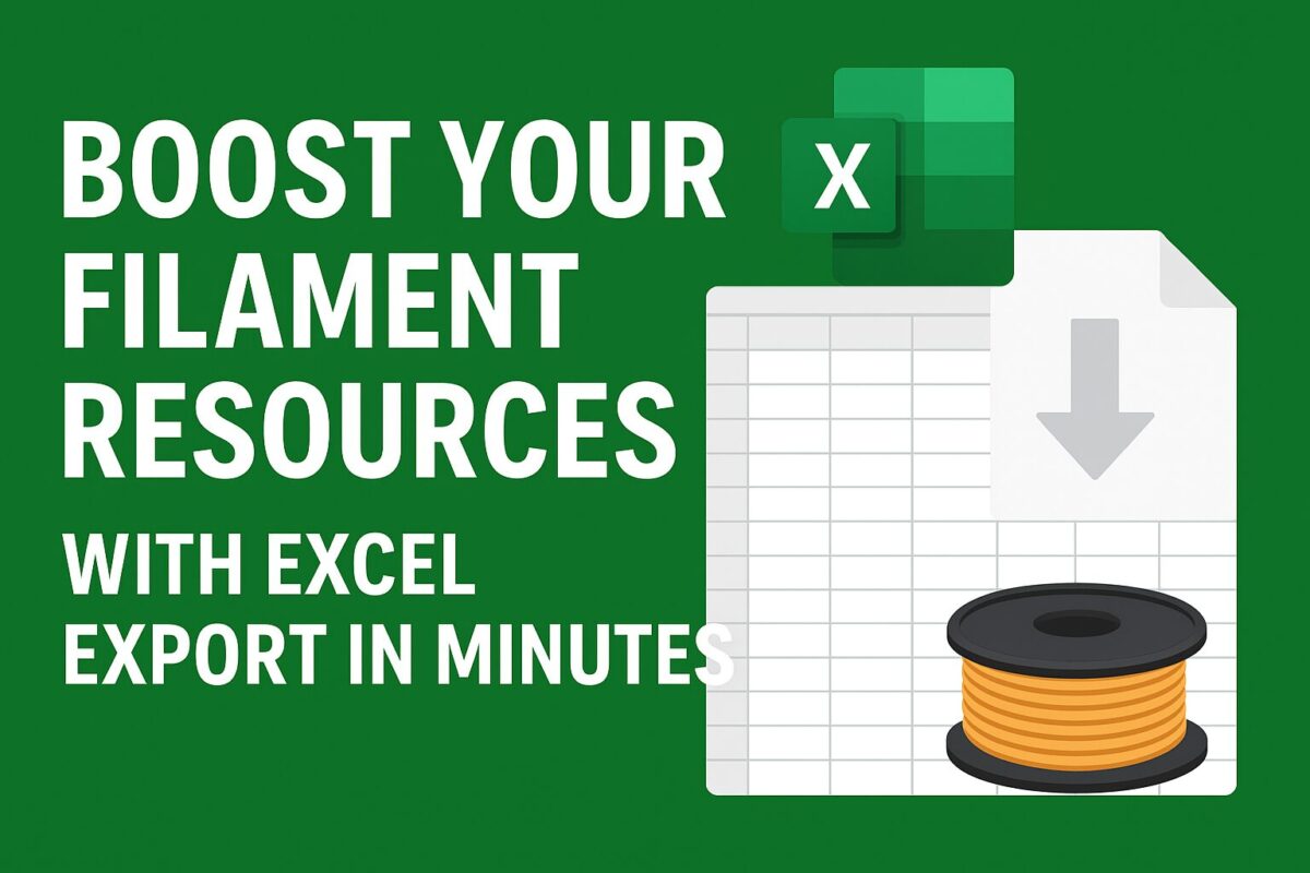
Learn how to add an Export to Excel button in Filament using Laravel Excel. Includes filter-aware exports and reusable QueryExport class.

Exporting data is a common requirement in admin panels. If you’re using Filament with Laravel, you can easily integrate Export to Excel functionality using the Maatwebsite/Laravel-Excel package.

This guide will show you step by step how to:

  • Install Laravel Excel
  • Create a reusable export class
  • Add an “Export to Excel” button in your Filament resource
  • Ensure exports respect filters and tabs
  • Match Filament table columns in Excel

Step 1: Install Laravel Excel

Run the following command in your project root folder to install Laravel Excel package:

composer require maatwebsite/excel

Step 2: Create a Generic Export Class

Instead of creating a new export class for every model, you can build one reusable export class:

<?php

namespace App\Exports;

use Illuminate\Database\Eloquent\Builder;
use Maatwebsite\Excel\Concerns\FromCollection;
use Maatwebsite\Excel\Concerns\WithHeadings;
use Maatwebsite\Excel\Concerns\WithMapping;

class QueryExport implements FromCollection, WithHeadings, WithMapping
{
    protected Builder $query;
    protected array $columns;

    public function __construct(Builder $query, array $columns = [])
    {
        $this->query = $query;
        $this->columns = $columns;
    }

    public function collection()
    {
        return $this->query->get();
    }

    public function headings(): array
    {
        return array_merge(
            ['ID'],
            collect($this->columns)
                ->map(fn($col) => $col->getLabel() ?? $col->getName())
                ->toArray()
        );
    }

    public function map($row): array
    {
        return array_merge(
            [$row->id],
            collect($this->columns)
                ->map(fn($col) => data_get($row, $col->getName()))
                ->toArray()
        );
    }
}

This class is reusable across all models/resources.

Step 3: Add Export Action in Filament

In your ListBrands (or any other List<Resource>) page, add a header action:

use App\Exports\QueryExport;
use Maatwebsite\Excel\Facades\Excel;
use Filament\Tables\Actions\Action;

Action::make('export')
    ->label('Export to Excel')
    ->icon('heroicon-o-arrow-down-tray')
    ->action(function ($livewire) {
        $query   = $livewire->getFilteredTableQuery(); // respects filters & tabs
        $columns = $livewire->getTable()->getColumns();

        return Excel::download(new QueryExport($query, $columns), 'brands.xlsx');
    }),

Step 4: How It Works

  • The export respects all filters, search, and tab constraints thanks to getFilteredTableQuery().
  • The export file includes the same columns as your Filament table.
  • The ID column is automatically prepended.

Conclusion

With just a few steps, you can add a powerful Excel export feature to any Filament resource. The approach we used:

  • Reusable QueryExport class
  • Filter & tab aware exports
  • Matching Filament table columns
  • ID column always included

This setup gives your admin panel professional-grade export functionality while staying flexible across different resources.

Filament Table Actions: Pro Tips Every Developer Should Know

Discover advanced tips to customize Filament table actions in Laravel. Learn how to auto-mutate data, load custom views in modals, and create state-toggling actions with confirmation and notifications.

Filament resource table actions offer powerful customization for crafting seamless admin experiences. Let’s explore some high-impact tricks every Laravel developer should know:

Trick 1: Automatically Mutate Form Data in the Edit Action

Need to auto-update a field every time you edit from the table? You can do this with the mutateFormDataUsing() method in your EditAction:

use Filament\Tables;
use Filament\Tables\Table;

public static function table(Table $table): Table
{
    return $table
        ->columns([
            // Your columns...
        ])
        ->actions([
            Tables\Actions\EditAction::make()
                ->mutateFormDataUsing(function (array $data): array {
                    $data['status'] = 'updated'; // auto-set status before save
                    return $data;
                }),
        ]);
}

This ensures the status field is automatically set to "updated" whenever an edit occurs.

Trick 2: Customize an Action to Load a View in a Modal

Standard actions don’t always cut it. For instance, you might want to display a list of users who liked a blog post in a modal. Here’s a clean way to do it:

Action::make('showLikes')
    ->label('Likes')
    ->icon('heroicon-o-heart')
    ->visible(fn($record) => $record->likes()->count() > 0)
    ->modalHeading('Likes')
    ->modalContent(function ($record) {
        return view('filament.components.likes-list', [
            'blogId' => $record->id,
        ]);
    })
    ->modalSubmitAction(false)
    ->modalCancelAction(false)
    ->modalWidth('lg'),

This opens a modal showing your custom view, without extra buttons.

Trick 3: Add a State-Toggling Action with Confirmation and Notification

Want a sleek toggle for boolean flags like activation status, complete with confirmation and feedback? Try this:

Tables\Actions\Action::make('toggleActive')
    ->label(fn($record) => $record->is_active ? 'Deactivate' : 'Activate')
    ->icon(fn($record) => $record->is_active ? 'heroicon-o-x-circle' : 'heroicon-o-check-circle')
    ->color(fn($record) => $record->is_active ? 'danger' : 'success')
    ->requiresConfirmation()
    ->action(function ($record) {

        $actionString = $record->is_active ? 'deactivated' : 'activated';

        $record->update([
            'is_active' => !$record->is_active,
        ]);

        Notification::make()
            ->title('Blog has been ' . $actionString . ' successfully')
            ->success()
            ->send();
    }),

This delivers an intuitive toggle experience—confirm first, then notify on change.


Why These Tips Matter

These action enhancements help you:

  • Automate workflows (e.g., setting status instantly in edit forms).
  • Visualize complex data elegantly (e.g., view likes in a modal).
  • Ensure user clarity and feedback with confirmation dialogs and notifications.

This is especially valuable when building advanced admin panels with Filament—turning UI logic into polished user experiences.

How to Insert Repeater Field Entries as Rows to Table in Laravel Filament

Learn how to convert repeater field JSON data into individual table rows in Laravel Filament using a custom button action. A practical guide for syncing structured form data.

When building admin panels using Laravel Filament, the Repeater field is a powerful way to collect dynamic sets of data — such as specifications, tags, or features. Often, these repeater entries are stored as a JSON array in the database. But what if you want to convert those JSON entries into individual rows in another table — for analytics, reporting, or normalization?

In this article, we’ll walk through how to:

  • Collect data using a Repeater field (stored as JSON)
  • Add a button to your Filament admin to insert each entry as a row in another table
  • Do this on-demand, without preloading data from the related table

The Use Case

Let’s assume you’re managing products with technical specifications.

  • You store specifications in a specifications JSON column of the products table using a Filament Repeater.
  • When a button is clicked (e.g., “Insert Repeater Entries”), each specification should be copied into a product_specifications table, with one row per entry.

Step-by-Step Guide

Step 1: Set Up the Repeater Field

Add a specifictions repeater field with multiple fields in product form as follows:

Repeater::make('specifications')
    ->schema([
        TextInput::make('key'),
        TextInput::make('value'),
        TextInput::make('unit'),
        TextInput::make('description'),
        TextInput::make('notes'),
    ])

This will create specifications repeater field in which you can add multiple rows of specifications for any product. This data is stored in the product_pecifications column of your products table as a JSON array.

Step 2: Create the Target Table

Create a migration for new table to hold individual specification entries using this command:

php artisan make:model ProductSpecification -m

It will create 2 files as follows:

  • Model File: app/Models/ProductSpecification.php
  • Migration File: database/migrations/xxxx_xx_xx_xxxxxx_create_product_specifications_table.php

Step 3: Run the Migration File

Update the migration file as per your repeater field entry as follows:

Schema::create('product_specifications', function (Blueprint $table) {
    $table->id();
    $table->foreignId('product_id')->constrained()->onDelete('cascade');
    $table->string('key')->nullable();
    $table->string('value')->nullable();
    $table->string('unit')->nullable();
    $table->text('description')->nullable();
    $table->text('notes')->nullable();
    $table->timestamps();
});

You can now run the migration using migrate command.

php artisan migrate

It will create a product_specifictions table in the database.

Step 4: Add a Button to Trigger the Insert

In your ProductResource\Pages\ViewProduct or EditProduct, add a custom action to generate specifications entries from the repeater field in product form.

use Filament\Actions\Action;

public function getHeaderActions(): array
{
    return [
        Action::make('Insert Repeater Entries')
            ->requiresConfirmation()
            ->action(function () {
                $specs = $this->record->specifications ?? [];

                if (!is_array($specs)) {
                    $specs = json_decode($specs, true) ?? [];
                }

                foreach ($specs as $spec) {
                    \App\Models\ProductSpecification::create([
                        'product_id'  => $this->record->id,
                        'key'         => $spec['key'] ?? null,
                        'value'       => $spec['value'] ?? null,
                        'unit'        => $spec['unit'] ?? null,
                        'description' => $spec['description'] ?? null,
                        'notes'       => $spec['notes'] ?? null,
                    ]);
                }

                $this->notify('success', 'Specifications inserted successfully.');
            }),
    ];
}

You can name the button anything, such as “Sync Specifications” or “Publish to Table”. It will manually extract the JSON data and insert it as rows in the product_specifications table.

Benefits of This Approach

  • Keeps your form simple and user friendly by storing repeater data in JSON.
  • Normalizes data later when needed — perfect for one-time inserts or batch operations.
  • Doesn’t require eager loading or nested relationship editing.

Avoid Duplicate Inserts

You can prevent duplicate imports by checking if rows already exists by adding the following check before adding the specifications in above code:

if ($this->record->productSpecifications()->exists()) {
    $this->notify('warning', 'Specifications already exist.');
    return;
}

Conclusion

Using repeater field gives you flexibility in how you manage structured, dynamic data in Laravel Filament. You can let users manage repeater fields easily, while keeping your database clean and relational by syncing data to separate tables on demand.

Whether for analytics, reporting, or integration, separating repeater entries into rows gives you the best of both worlds: JSON-based forms with relational data power.

Build a Custom Multi-Column Checkbox Dropdown in Filament

Learn how to build a user-friendly multi-column custom checkbox dropdown using Laravel Filament to provide improved and better selection options for your users.

Filament is a powerful admin panel for Laravel, but sometimes your UI needs go beyond its built-in fields. In this tutorial, we’ll walk through how to build a custom checkbox dropdown component in Filament that supports multiple columns and compatible with dark mode.

Goal

We want to display a dropdown that, when opened, shows a list of checkboxes (e.g. for selecting items). The checkboxes should:

  • Be selectable via checkboxes
  • Be arranged in multiple columns
  • Store selections in a Livewire model
  • Work with dark mode

The purpose for this component is, I have a list of more than 100 entries. If I take CheckboxList component, all of these entries take so much space in UI. Similarly, If I add multiselect Select component, It will not show all entries at once and user have to type name to search for entries.

So, dropdown will reduce the space in UI and checkboxes solve searching problem.

Step 1: Create the Custom Field Component

Create the filament custom checkbox dropdown field component file at app/Forms/Components/CheckboxDropdown.php and add the following code.

<?php
namespace App\Forms\Components;

use Filament\Forms\Components\Field;

class CheckboxDropdown extends Field
{
    protected string $view = 'forms.components.checkbox-dropdown';

    protected array $options = [];

    protected int $checkboxColumns = 1;

    public function options(array $options): static
    {
        $this->options = $options;
        return $this;
    }

    public function getOptions(): array
    {
        return $this->evaluate($this->options);
    }

    public function checkboxColumns(int $count): static
    {
        $this->checkboxColumns = $count;
        return $this;
    }

    public function getCheckboxColumns(): int
    {
        return $this->evaluate($this->checkboxColumns);
    }
}

Step 2: Create a blade view file for the component

As mentioned in the component class, create a custom checkbox dropdown component view file at resources/views/forms/components/checkbox-dropdown.blade.php and add the following code.

@php
$options = collect($getOptions())->mapWithKeys(fn ($label, $id) => [(string) $id => $label]);
$jsonOptions = $options->toJson();
$gridCols = match ($getCheckboxColumns()) {
    1 => 'grid-cols-1',
    2 => 'grid-cols-2',
    3 => 'grid-cols-3',
    4 => 'grid-cols-4',
    default => 'grid-cols-1',
};
@endphp

<div
    x-data="{
        open: false,
        toggle() { this.open = !this.open },
        selected: @js($getState() ?? []),
        liveSelected: @entangle($attributes->wire('model')).defer,
        options: {{ $jsonOptions }} || {},
        isSelected(id) {
            return this.selected?.includes(id);
        },
        labelFor(id) {
            if (!this.options || typeof this.options !== 'object') return id;
            return this.options[id] ?? id;
        }
    }"
    class="relative">
    <!-- Trigger Button -->
    <button
        type="button"
        @click="toggle"
        class="w-full border rounded px-3 py-2 text-left bg-white dark:bg-gray-900 border-gray-300 dark:border-gray-700 text-gray-800 dark:text-gray-200 shadow-sm">
        <template x-if="selected?.length">
            <span x-text="selected.map(labelFor).join(', ')"></span>
        </template>
        <template x-if="!selected?.length">
            <span class="text-gray-400 dark:text-gray-500">Select items...</span>
        </template>
    </button>

    <!-- Dropdown Panel -->
    <div
        x-show="open"
        @click.away="open = false"
        x-cloak
        class="absolute z-10 w-full mt-1 rounded border bg-white dark:bg-gray-900 border-gray-300 dark:border-gray-700 shadow max-h-60 overflow-y-auto">
        <ul class="p-2 grid {{ $gridCols }} space-y-1 gap-2">
            <template x-for="(label, id) in options" :key="id">
                <li>
                    <label class="flex gap-2 items-start space-x-2 text-gray-800 dark:text-gray-200">
                        <input
                            type="checkbox"
                            class="fi-checkbox-input rounded border-none bg-white shadow-sm ring-1 transition duration-75 checked:ring-0 focus:ring-2 focus:ring-offset-0 disabled:pointer-events-none disabled:bg-gray-50 disabled:text-gray-50 disabled:checked:bg-gray-400 disabled:checked:text-gray-400 dark:bg-white/5 dark:disabled:bg-transparent dark:disabled:checked:bg-gray-600 text-primary-600 ring-gray-950/10 focus:ring-primary-600 checked:focus:ring-primary-500/50 dark:text-primary-500 dark:ring-white/20 dark:checked:bg-primary-500 dark:focus:ring-primary-500 dark:checked:focus:ring-primary-400/50 dark:disabled:ring-white/10 mt-1"
                            :value="id"
                            :checked="isSelected(id)"
                            @change="
                                if (isSelected(id)) {
                                    selected = selected.filter(i => i !== id)
                                } else {
                                    selected.push(id)
                                }
                                liveSelected = selected;
                            ">
                        <span x-text="label"></span>
                    </label>
                </li>
            </template>
        </ul>
    </div>
</div>

Now this component id ready to use. Currently, it can adopt current filament admin panel theme and you can distribute checkboxes to multiple columns using checkboxColumns option.

Step 3: Usage in Filament Resource

You can use this custom checkbox dropdown component in any resource file as follows:

CheckboxDropdown::make('selected_items')
    ->label('Select Items')
    ->options(Item::pluck('name', 'id')->toArray())
    ->checkboxColumns(3)

Conclusion

With this setup, you can develop a fully reusable, dynamic, and user-friendly multi-column checkbox dropdown — perfect for any Laravel Filament project.