When building responsive websites, CSS media queries are your best friend. They let you fine-tune layouts for different devices, screen sizes, resolutions, and input types. But sometimes media queries can look complicated — especially when dealing with device widths, pixel ratios, and hover/pointer detection.
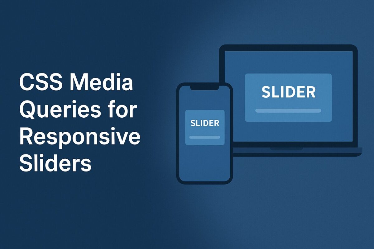
In this post, we’ll break down three CSS media queries that are often used to optimize sliders (.ftslider) for iPhones, high-density screens, and hybrid touch devices. By the end, you’ll understand exactly what each query targets, why it’s written that way, and how it affects your design.
Targeting iPhone X–Style Devices
@media only screen and (min-device-width: 375px) and (max-device-width: 812px)
and (-webkit-min-device-pixel-ratio: 3) {
  .ftslider { height: calc(90vh - 85px); }
}
The above @media query targets iPhone X–style devices (and similar), because:
min-device-width: 375px– the device width is at least 375px.max-device-width: 812px– the device width is at most 812px.- This matches iPhones in the 375×812 portrait range (like iPhone X, XS, 11 Pro, etc.).
-webkit-min-device-pixel-ratio: 3→ ensures the device has a Retina 3x screen density.
Handling High-Resolution Displays (Cross-Browser)
@media only screen and (-webkit-min-device-pixel-ratio: 3),
only screen and (-o-min-device-pixel-ratio: 3/1),
only screen and (min-resolution: 458dpi),
only screen and (min-resolution: 3dppx) {
  .ftslider { height: calc(90vh - 85px); }
}
This @media query targets high-resolution displays (3x pixel density or higher), but in a cross-browser compatible way:
-webkit-min-device-pixel-ratio: 3– WebKit (Safari, Chrome).-o-min-device-pixel-ratio: 3/1– Opera (old syntax).min-resolution: 458dpi– very high DPI screens (approx 3× standard 96dpi).min-resolution: 3dppx– modern way to express “3 device pixels per CSS pixel”.
Hybrid Devices: Hover + Coarse Pointer
@media only screen and (hover: hover) and (pointer: coarse) {
  .ftslider { height: calc(85vh - 55px); }
}
It targets devices that support hover and use a coarse pointer (e.g., touch + stylus hybrids).
Why This Matters
- Better UX: Users on high-DPI devices get clean, non-clipped layouts.
- Cross-platform support: Android, iOS, tablets, and hybrid devices all behave predictably.
- Future-proofing: By writing broad yet precise queries, your design adapts to new device types.
Conclusion
Media queries may look intimidating at first glance, but each one has a specific purpose. In this case, they ensure sliders adapt smoothly across iPhones, high-DPI displays, and hybrid touch devices.
When building responsive designs, don’t just think in terms of width and height – consider pixel density, hover ability, and pointer type. That’s the key to delivering a seamless user experience on any screen.