
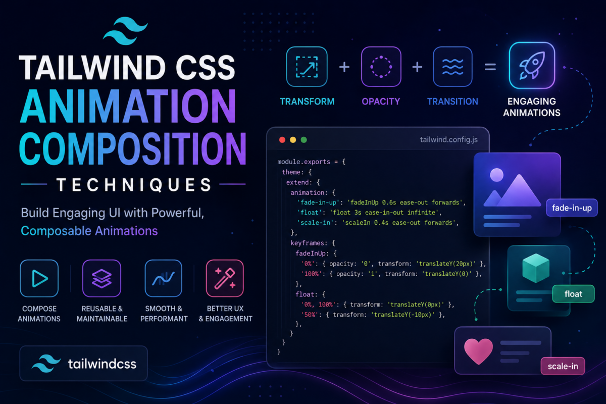
As a developer working with Tailwind CSS, you’re likely familiar with its powerful utility classes for styling and layout. However, when it comes to animations, things can get complicated quickly. You’ve probably spent hours wrestling with clashing animation styles, trying to achieve even the simplest of effects. And let’s be honest, using raw CSS for complex animations is a chore.
You’ll build a Tailwind project that springs to life with smooth, composed animations. By the end of this tutorial, you’ll have learned how to create custom animations using Framer Motion’s API and integrate them seamlessly into your components. Specifically, you’ll learn how to configure animation settings for efficient composition (Section 2) and animate components with Tailwind CSS utility classes and Framer Motion (Section 4). With these skills in hand, you’ll be able to breathe new life into your projects and elevate the user experience.
Enabling Framer Motion in a Tailwind CSS Project
To integrate Framer Motion with Tailwind CSS, you’ll need to install both libraries and set up their configurations properly. Assuming you have a new Laravel project set up (Laravel uses Vite for front-end assets), let’s start by installing the required packages. Framer Motion is a React library, so we’ll use React for the front end.
First, run the following command in your terminal:
npm install tailwindcss @tailwindcss/vite framer-motion react react-dom
npm install --save-dev @vitejs/plugin-react
Next, add the necessary configuration to your vite.config.js file (for Laravel):
import { defineConfig } from 'vite';
import laravel from 'laravel-vite-plugin';
import react from '@vitejs/plugin-react';
import tailwindcss from '@tailwindcss/vite';

export default defineConfig({
    plugins: [
        laravel({
            input: ['resources/css/app.css', 'resources/js/app.jsx'],
            refresh: true,
        }),
        react(),
        tailwindcss(),
    ],
});
Then, import Tailwind in your resources/css/app.css file (with the Tailwind Vite plugin, no separate PostCSS configuration is needed):
@import "tailwindcss";Now that we have both libraries installed and configured, let’s verify the integration. Create a new file resources/js/components/HelloWorld.jsx with the following content:
import { motion } from 'framer-motion';

export default function HelloWorld() {
    return (
        <motion.div
            className="p-4 text-2xl font-bold text-blue-600"
            initial={{ opacity: 0, y: -20 }}
            animate={{ opacity: 1, y: 0 }}
            transition={{ duration: 0.5 }}
        >
            Hello World!
        </motion.div>
    );
}
Render this component from your resources/js/app.jsx entry point (rename Laravel’s default resources/js/app.js to match the input in vite.config.js):
// resources/js/app.jsx
import { createRoot } from 'react-dom/client';
import HelloWorld from './components/HelloWorld';

createRoot(document.getElementById('app')).render(<HelloWorld />);
Then give the page a mount point in a Blade view such as resources/views/welcome.blade.php. The @viteReactRefresh directive must come before @vite so React Fast Refresh works during development:
<head>
    @viteReactRefresh
    @vite(['resources/css/app.css', 'resources/js/app.jsx'])
</head>
<body>
    <div id="app"></div>
</body>
Now run npm run dev alongside php artisan serve. When you open the application, you should see the “Hello World!” text animating. This verifies that Framer Motion is integrated and working with Tailwind CSS in your project.
Configuring Animation Settings for Efficient Composition
Now that Framer Motion is integrated into your Tailwind CSS project, it’s essential to configure animation settings for efficient composition. This involves defining animation defaults and customizing them as needed.
Create a new file called resources/js/motion.config.js with the following content:
export const defaultTransition = {
  // Set default animation duration to 300ms
  duration: 0.3,
  ease: 'easeInOut',
};
In this motion.config.js file, you can define various settings such as animation duration and easing. To apply these defaults, wrap your app in Framer Motion’s MotionConfig component, for example <MotionConfig transition={defaultTransition}>. These defaults will be applied to all animations unless overridden at the component level.
To override these settings for a specific component or animation, simply pass a transition prop with the desired changes when rendering motion.div, motion.span, etc. For example:
// In your React component
<motion.div
    className="bg-red-500 rounded-full p-4"
    animate={{ scale: 1.1 }}
    transition={{ duration: 0.6, ease: 'easeInOut' }}
>
    {/* animated content here */}
</motion.div>
Alternatively, you can create custom animation variants in your motion.config.js file:
export const variants = {
  fadeOut: { opacity: 0 },
  fadeIn: { opacity: 1 },
};
Then use these variants when animating components or elements by passing them to the variants prop and referring to them by name, e.g. initial="fadeOut" animate="fadeIn".
Creating Custom Animations with Framer Motion’s API
Framer Motion provides a robust API for creating custom animations. This allows you to define complex animation behaviors that can be reused throughout your application.
To create a custom animation, you’ll need to import the motion component from framer-motion. Here’s an example of how you might define a simple animation:
import { motion } from 'framer-motion';

const slideIn = {
    hidden: { opacity: 0, x: -20 },
    visible: { opacity: 1, x: 0 },
};
This animation starts with an opacity of 0 and a translation of -20px, then transitions to an opacity of 1 and a translation of 0. You can add more properties to each variant or tweak the easing function using the transition option.
To use this custom animation, you’ll need to pass it to a motion component’s variants prop:
export default function Example() {
    return (
        <motion.section initial="hidden" animate="visible" variants={slideIn}>
            <motion.h2 variants={slideIn}>Welcome</motion.h2>
            <motion.p variants={slideIn}>This content slides in.</motion.p>
        </motion.section>
    );
}
This will apply the animation to all motion elements within the section, because child motion components inherit the parent’s variant names. You can also use animations as part of a larger composition by orchestrating them with transition options such as staggerChildren and when: ‘beforeChildren’.
Framer Motion’s API provides an enormous amount of flexibility for creating complex animations, and mastering it will take some practice.
Animating Components with Tailwind CSS Utility Classes and Framer Motion
Now that you’ve set up Framer Motion in your project, it’s time to put its animation capabilities to use by combining it with Tailwind CSS utility classes. This approach allows you to create visually appealing animations without writing any custom CSS keyframes.
To animate a component using Tailwind CSS utility classes and Framer Motion, start by importing the required components from framer-motion:
import { motion } from 'framer-motion';Next, define your animation settings in a variants object. For this example, let’s create a simple scale animation with easing:
const variants = {
    rest: { scale: 1 },
    hover: { scale: 1.1, transition: { ease: 'easeOut', duration: 0.2 } },
};
Now, apply Tailwind CSS utility classes to the component you want to animate. For instance, let’s create a button that scales in on hover:
<motion.button className="inline-block bg-blue-500 hover:bg-blue-700 text-white font-bold py-2 px-4 rounded">
    Scale in on Hover!
</motion.button>
Finally, pass the variants object to the variants prop and specify which animation variant to use at rest (rest) and on hover (hover, via whileHover):
<motion.button
    className="inline-block bg-blue-500 hover:bg-blue-700 text-white font-bold py-2 px-4 rounded"
    variants={variants}
    initial="rest"
    whileHover="hover"
>
    Scale in on Hover!
</motion.button>
That’s it! Your component should now smoothly scale in when hovered, leveraging the power of both Tailwind CSS utility classes and Framer Motion.
Using React Hooks to Control Complex Animations
Complex animations often require intricate control over their state and lifecycle. Framer Motion’s API provides a robust set of tools for managing animations programmatically. By leveraging React hooks, you can create highly dynamic and responsive animations.
Let’s explore how to use the useAnimationControls hook from Framer Motion to control a complex animation:
// resources/js/components/ComplexAnimation.jsx
import { motion, useAnimationControls } from 'framer-motion';

export default function ComplexAnimation() {
    const controls = useAnimationControls();

    return (
        <div>
            <motion.div className="w-16 h-16 rounded bg-indigo-500" animate={controls} />
            <button onClick={() => controls.start({ x: 200, rotate: 360, transition: { duration: 2 } })}>Start Animation</button>
            <button onClick={() => controls.stop()}>Stop Animation</button>
        </div>
    );
}
To control the animation, you can use the start() and stop() methods. For more complex scenarios, consider using the useCycle hook to manage multiple states within a single animation.
// resources/js/components/CycleAnimation.jsx
import { motion, useCycle } from 'framer-motion';

export default function CycleAnimation() {
    const [position, cyclePosition] = useCycle(
        { x: 0, y: 0 },
        { x: 100, y: 100 },
    );

    return (
        <div>
            <motion.div className="w-16 h-16 rounded bg-pink-500" animate={position} />
            <button onClick={() => cyclePosition()}>Next State</button>
        </div>
    );
}
By utilizing React hooks with Framer Motion’s API, you can create highly customizable and responsive animations that adapt to your application’s needs.
Advanced Techniques: Chaining and Grouping Animations with Framer Motion
Chaining and Grouping Animations with Framer Motion
Framer Motion offers a powerful way to chain and group animations together, allowing for more complex and dynamic interactions in your application. This can be achieved using the animate function returned by the useAnimate hook, which returns a promise you can await to run animations one after another, or combine with Promise.all to run them together.
To chain animations together, you can use the following syntax:
import { useEffect } from 'react';
import { useAnimate } from 'framer-motion';

export default function ChainedCard() {
    const [scope, animate] = useAnimate();

    useEffect(() => {
        // Chain two animations together
        async function sequence() {
            await animate(scope.current, { opacity: [0, 1] }, { delay: 0.5 });
            await animate(scope.current, { x: [-100, 0] });
        }

        sequence();
    }, []);

    return <div ref={scope} className="p-6 rounded-lg bg-white shadow">Chained!</div>;
}
This will first animate the element to opacity: 1 with a delay of 0.5 seconds, and then, once that finishes, animate it to x: 0.
To group animations together so they start at the same time, you can start them without awaiting each one and wait for all of them with Promise.all:
// Group two animations together (inside the same component)
async function group() {
    await Promise.all([
        animate(scope.current, { opacity: [0, 1] }, { delay: 0.5 }),
        animate(scope.current, { x: [-100, 0] }),
    ]);
}
This will run both animations in parallel, while still allowing you to control the timing and behavior of each animation.
By using these techniques, you can create complex and engaging animations that bring your application to life. With Framer Motion’s powerful API and Tailwind CSS’s utility-first approach, you have all the tools you need to take your UI interactions to the next level.
Frequently Asked Questions
How do I install Framer Motion in a Tailwind CSS project?
To integrate Framer Motion with Tailwind CSS, run the command npm install tailwindcss @tailwindcss/vite framer-motion react react-dom (plus @vitejs/plugin-react as a dev dependency). Then, register the React and Tailwind plugins in your vite.config.js file and add @import "tailwindcss"; to your CSS.
Why do I need to configure animation settings for efficient composition?
Configuring animation settings helps you define default animations and customize them as needed, ensuring smooth and composed animations in your project. This is essential when working with Framer Motion and Tailwind CSS together.
How do I verify the integration of Framer Motion with Tailwind CSS?
Create a new React component (e.g., HelloWorld.jsx) and use Framer Motion’s motion components. When you run your application, the component should animate correctly, verifying that Framer Motion is integrated and working with Tailwind CSS.
What is the purpose of the motion.config.js file in a Tailwind CSS project?
The motion.config.js file allows you to define animation defaults and customize them as needed for efficient composition. It’s where you can set default animation durations, easing functions, and other settings, which you then apply app-wide through the MotionConfig component.
Can I use Framer Motion with Tailwind CSS utility classes?
Yes, you can animate components with both Tailwind CSS utility classes and Framer Motion. This allows for a flexible and powerful way to create animations in your project.